
Excel Practice
Making a Pie Chart in Excel
Video Source (04:11 mins) | Transcript
Step 1: Have a list of data in Excel
This data can be numbers or percentages. The pie chart will be a representation of the percentages of the data total.
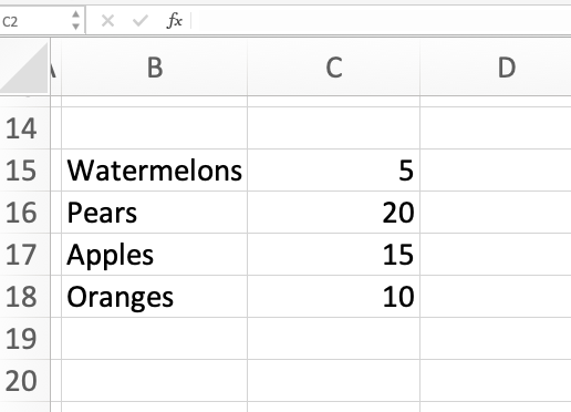
Example 1:
Here is a list of different fruits and the number of each. Notice that they add up to a total of 50.
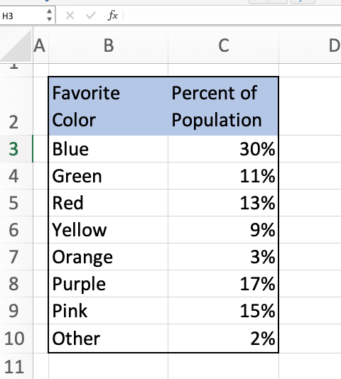
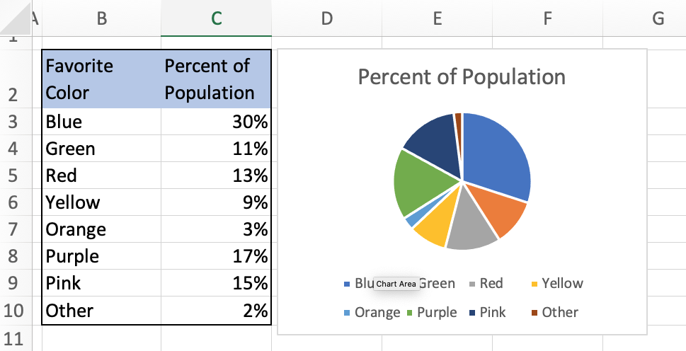
Example 2:
Here is a list of the favorite color percentages of some population of people. Notice that the total percentage adds up to 100%.
Step 2: Highlight the data
Highlight the data. If you want to have the labels on the chart, you need to highlight the labels of the data as well.
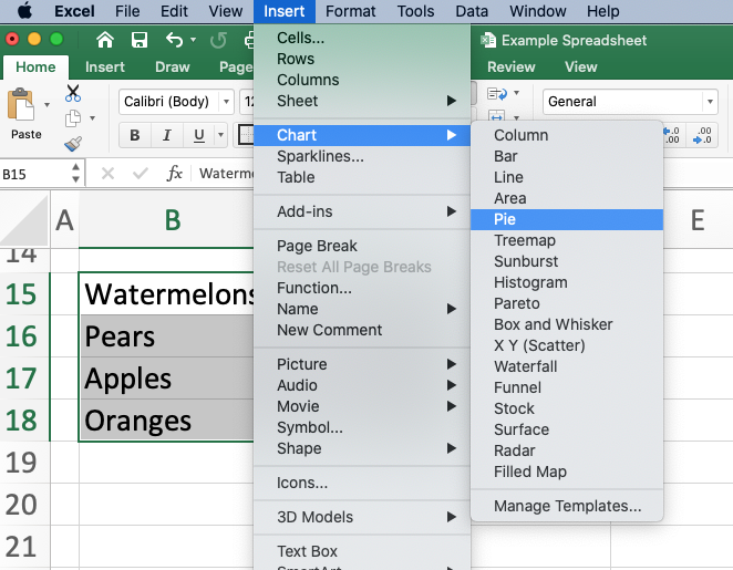
Step 3: In Excel, go to INSERT in the menu. Then select CHART. Then select PIE
Excel will automatically create a pie chart for you. You can adjust the size by pushing and pulling on the sides of the chart. You can also edit the appearance of the chart using the menu bar at the top or by double-clicking on different parts of the chart.
Example 1:
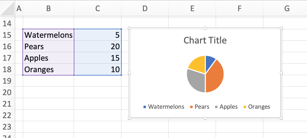
Notice that the pie wedges are not a representation of the numbers in the column, but the percentage of the total. Since our list of fruits add up to 50, the wedges are the percentage calculated as the number divided by 50.
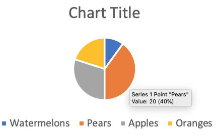
Since we have 20 pears, the orange wedge is 20/50=40% of the whole pie chart. We can see this percentage by hovering over a wedge in the chart.
Example 2:
This list of percentages add up to 100%, so our pie chart is an accurate representation of the percentages. If they didn’t add up to 100%, then the wedges of the pie chart would be different than the percentages listed.
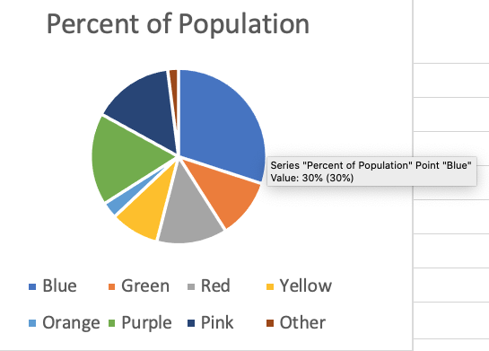
Because our list of percentages added up to 100%, the blue wedge that represents that 30% of the population like the color blue is also 30% of the pie chart. We can see this by hovering over the wedge.